
“Painting is an easy way to boost the appeal of your home. However, if wrongly it can just as easily ruin your home. Your home can either impress or put off”
Paint is an easy way to boost home appeal much as it can ruin it if wrongly selected. Remember, the appearance of your home either welcomes guests or puts them off. Paint has power to determine whether the homeowner will enjoy the comfort of their home or not, which is why it has to be respected

Colour creates a mood I a room and can also affect the occupants mood, In other words, colour choices made for home interiors and exteriors affect family members. The colour you select for various rooms and the exterior can have different effects, depending on the personality needs of individuals, good colour should evoke emotions to make you want to stay in that particular space.
Wheel Of Colours
Colours from the warm half of the colour wheel, such as red, orange and yellow are good for energising, while those on the cooler side of the wheel, such as blue, green and lavender, aid relaxation. Be careful when choosing colour choices for different age groups.
People react differently to colour. We are affected on a physical, mental and emotional level. Some can be agitated, develop goose pimples or get heart attacks, imagine being locked in a black room. Black does not contribute to wellness. Besides it does not reflect light but absorbs it. If you need to use a room with black walls, you still need more light.
Colour can make people permanently angry at home, while one the other hand for a pink room brings temper down. If painting as school note that primary school learners need pastel colours to focus, whereas secondary and tertiary learners need medium tinted colours to recall and process information. A medium shade of yellow, rather than bright yellow, is good for memory recall.
Bright saturated or loud colours on both sides of the colour wheels are best for pause areas such as passages or a feature wall. Bright colours sometimes stimulate learners, so go for deeper or armber colours. Additionally, our bodies need constant balance of colour, they crave particular colours they lack. This is seen when people develop an attachment to certain items and foods.
Adults Affected By Colours
Elsewhere, colour choices affected employees and clients at workplaces such as offices, restaurants, hotels and recreation centers. Tests have proved that placing people in a red restaurant will make them feel more energetic as red, with its long wave length, increases a person’s blood pressure and heartbeat. A person suffer from anxiety, anger or increased blood pressure, they will not have fun in the red restaurant but rather feel stressed and agitated.
For Different Spaces

Choosing the right colour pallete for different home spaces can seem daunting. However with the right colour, rooms can be transformed with a fresh breath of air. Ensure the bedrooms, lounge, dining room, kitchen, balconies, corridor and the entire home have the appropriate colours. For example, yellow is a happy colour, but should not be painted on all wallsin a bedroom.
The colour you choose for your home directly affects you and your family mood. No one wants to stay or wake up to a boring beige space, since bedrooms are best for relaxing, give them soft and calming colours such as taupe, fresh linen, vanilla, afternoon shower Y4-C2-3, periwinkle blue, mystic morn B6-C2-2 or butter yellow tints. You can also try Phlox field Y4-A2-A1-4 or lighter whit Mass Y4-A2-2.
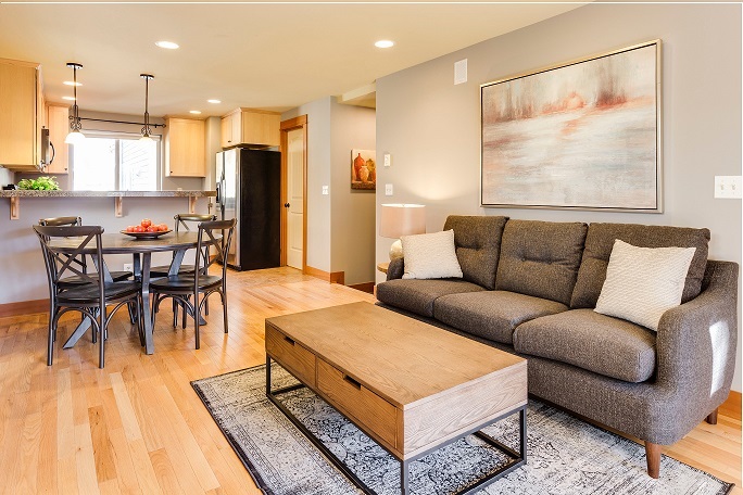
Lounges are often open plan so it is best to use a natural neutral wall colour such as ivory parchment Y3-D2-3, it works with the flooring to which an option is to add colour on an accent wall or on kitchen units. Meanwhile, dining rooms need to have a calm colour that enhances communication and makes visitors comfortable for them to enjoy a good meal.
Select colours in the peach or terracotta range. Pasta Primavera 04-C2-1 or Rooibos R6-C1-2 are worth sampling. The key to pulling off a good paint colour scheme for a child’s rooms is to combine neutrals such as soothing grey with pops of bright colours.
Funky Feature
Create funky feature walls using wall paper, art work and pictures before you consider using blood colous such turquor, mustard and reds. Angel blue is brilliant, while white and lemon green represents growth just like pink is fun.
“A dream to reality”


